Visualising Pandora Data
Table of Contents
Pandora does not come with its own visualisation tools, and not all of its outputs can be visualised with common tools (like the fasta-like pangenome graph that is used as mapping reference). Nevertheless, I wanted to have a look at graph outputs from Pandora that can be visualised with other tools, like the graphs for the sequence clusters after indexing the pangenome graph, or the mapping results themselves, which come in GFA format.
Visualising graphs
Core genes
Single genes in Bandage
Bandage, a nice graph visualisation tool, has executables also for Windows, so I’m using this to visualise single gene graphs while the mapping is running.
I randomly took the first graph file - GC00000001_11_na_aln.fa.k15.w14.gfa - to download it to my PC and load it into Bandage. The graph inside is very loopy for a single gene - I think I have to compare this to the multiple sequence alignment.
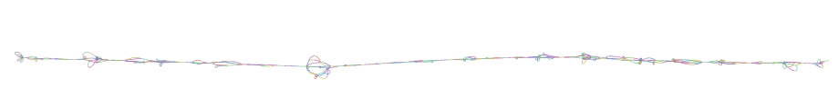
Overview of the GC00000001_11 graph in Bandage
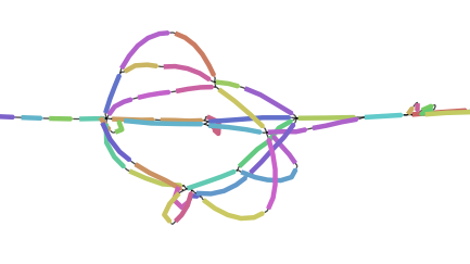
Detail of the GC00000001_11 graph in Bandage
cd /data3/genome_graphs/panX_paeru/core_gene_alignments
gunzip GC00000001_11_na_aln.fa.gz
I opened the fasta in UGENE as a multiple sequence alignment and the sequences look pretty similar to me. They don’t all have the same length, but otherwise…

Similarity of the GC00000001_11 sequences in UGENE
I think I will have to install odgi or get vg to work to see sequence details and figure out where the loops come from.
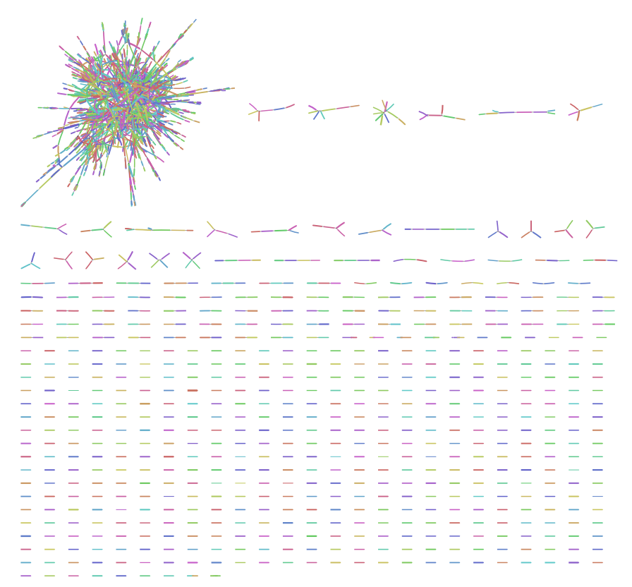
Core gene mapping results in Bandage
The graph that is created by mapping reads to the pangenome (with the standard settings) is not too big, so I think I can download and visualise that as well.
pandora.pangraph.gfa in Bandage - overview of CH3797
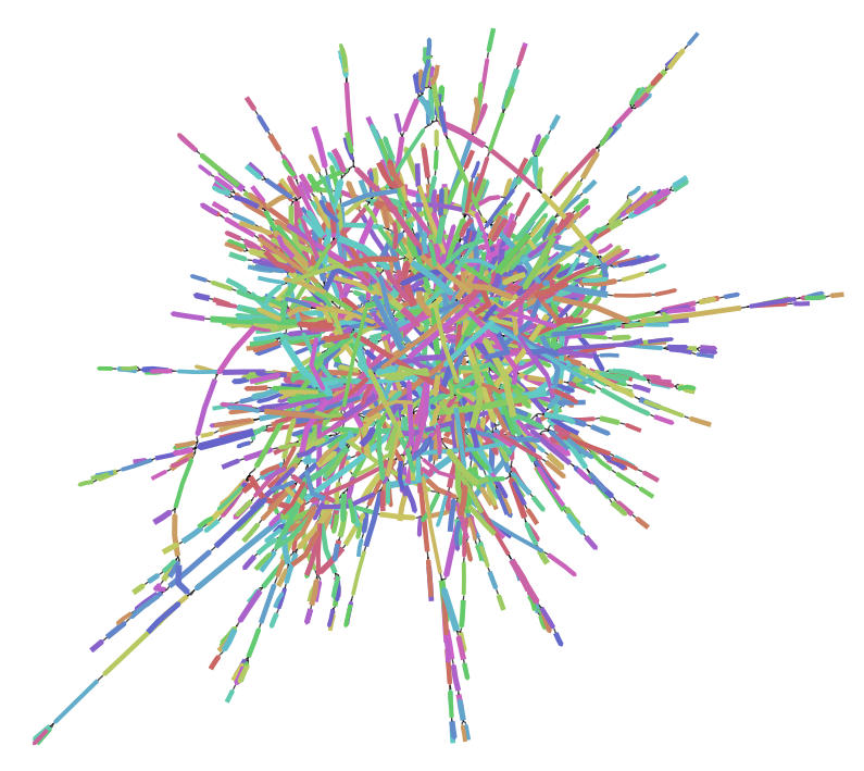
pandora.pangraph.gfa in Bandage - detail of CH3797
It looks like some of the core genes were combined, either to that huge mess or to smaller, more or less linear, groups. But this is a mapping result, so I’m not sure how one would interpret this.
Clicking on nodes in Bandage returns some more details: apparently all of them are only 1 bp long, but their IDs look like those of the core genes I used when creating the “pangenome”. This doesn’t look useful at all.
Open Questions
- Why are single gene graphs so loopy?
Answers from Zamin Iqbal
- The reason why single graphs after indexing are so loopy is Bandage iself, which has no other possibility of visualising the graphs.